REI Co-op
Designing a documentation platform
More comprehensive guidance
REI saw significant growth and expansion of their Design System, Cedar. Through collaborative efforts across multiple teams and platforms, I took the lead spearheading a team to integrate enhancements, education, components, and patterns into the system. This involved utilizing best practices, conducting thorough research, rigorous testing, and continuous learning to ensure the system's effectiveness and efficiency.
The problem
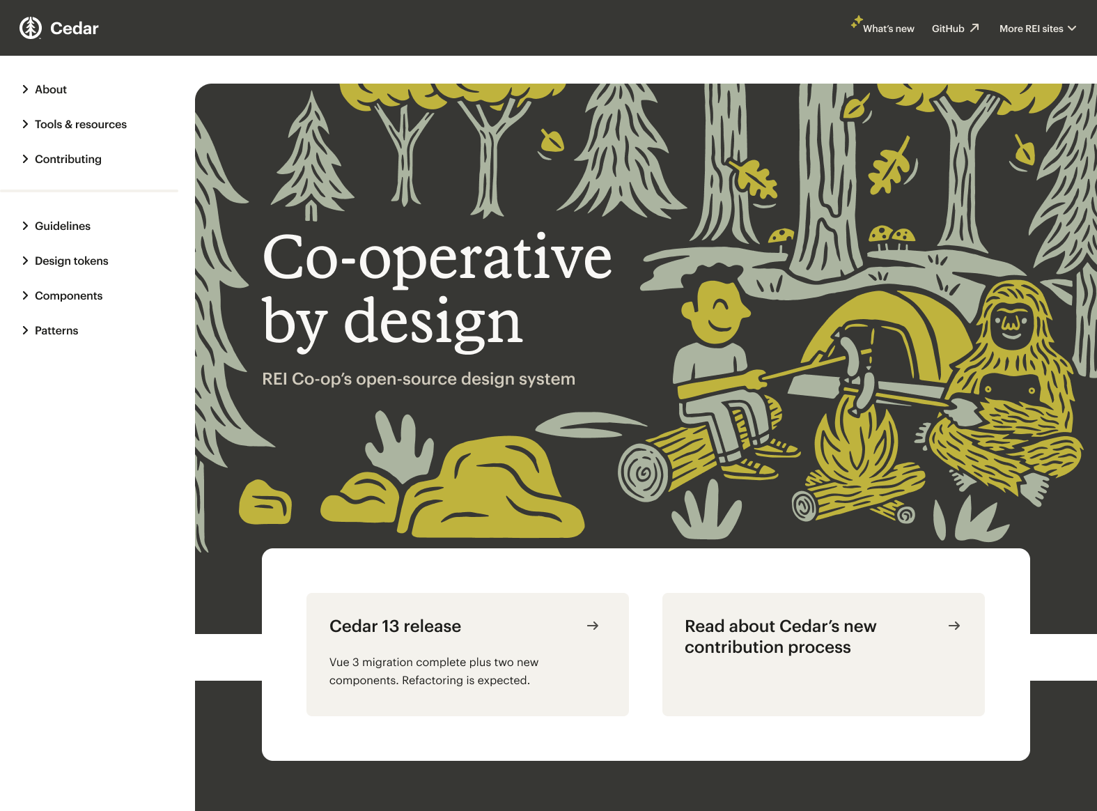
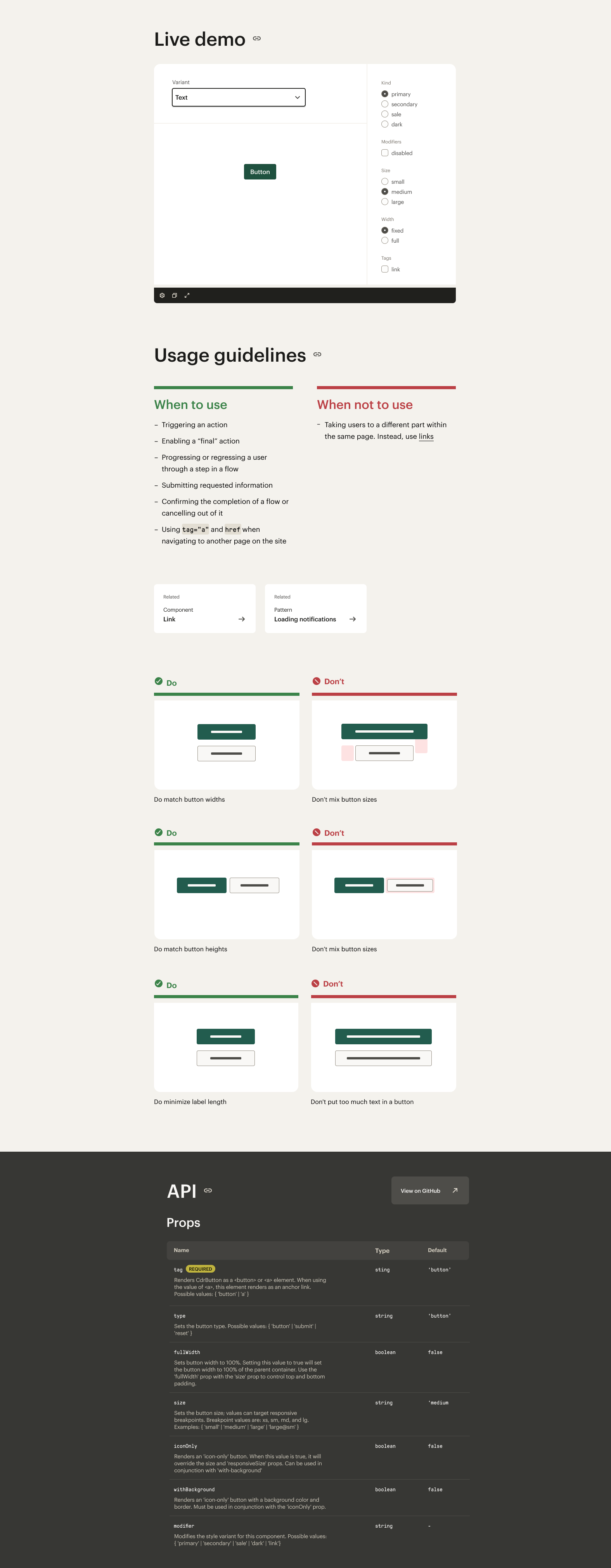
The Cedar website was becoming increasingly difficult to maintain. It didn't visually represent the system or brand, and it was challenging for our users. With multiple opportunities to scale on the horizon, we saw an opportunity to test a multi-themed design token architecture using a fresh experience.

Empathizing & planning
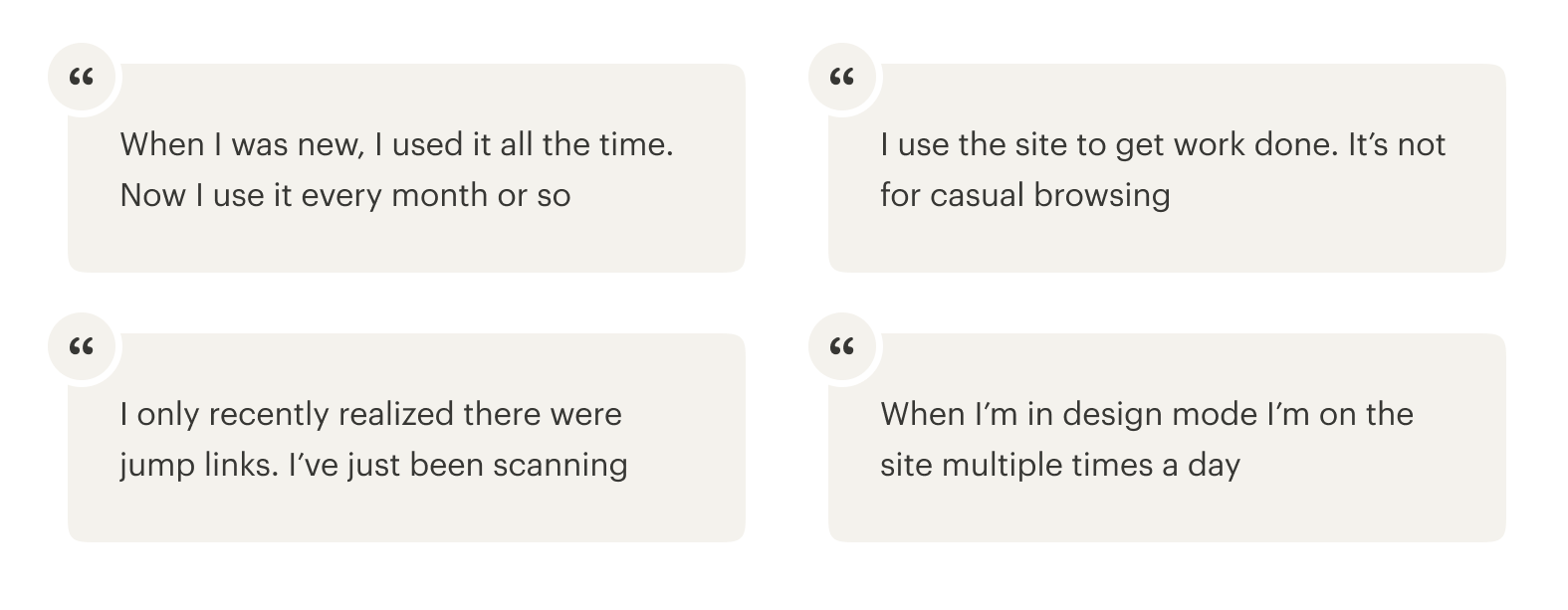
I derived key findings through a series of in-depth cross-disciplinary user interviews. By engaging with users in meaningful conversations, we uncovered pivotal concepts and features, which were subsequently presented to the Cedar team. In order to propel the project forward, I orchestrated a comprehensive workshop to ensure team alignment on the project roadmap and to establish the next crucial steps.
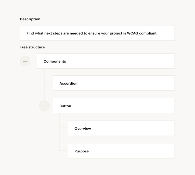
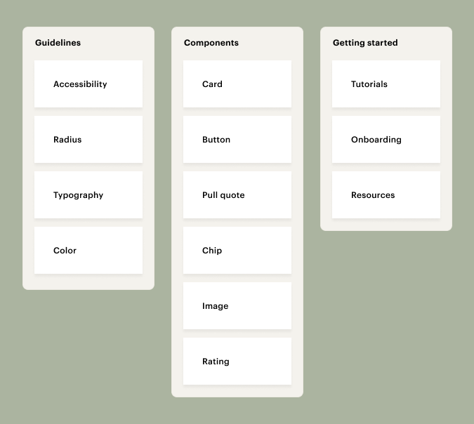
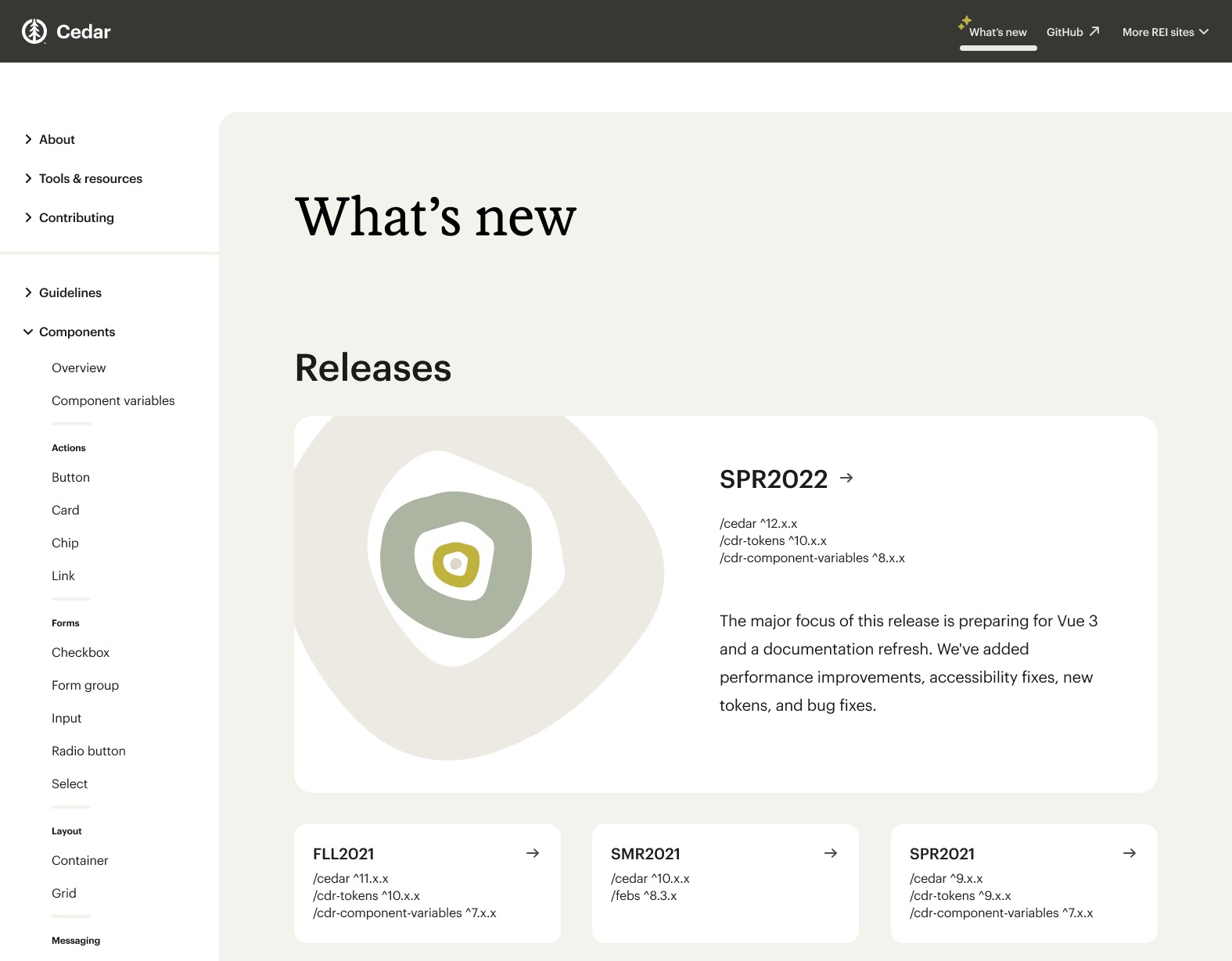
Information architecture
After conducting card sorting and tree testing, I aligned the team on a valuable opportunity: enhance users' comprehension of the interconnections among system elements. We identified strategies to ensure the navigation system remains flexible and adaptable for future expansion.
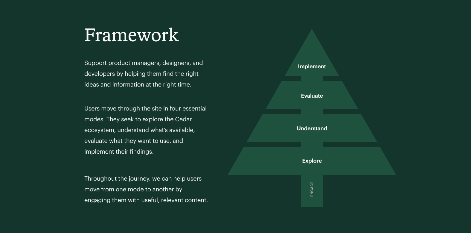
Content framework
Through user research, we pinpointed the pivotal steps in the user journey that lead users to their objectives.
Our findings revealed that users navigate the site based on their specific content requirements, which we categorized into four distinct stages: explore, understand, evaluate, and implement. This approach empowered us to tailor the breadth and technical depth of our content, articulate complex concepts effectively, and meticulously structure each page to optimize user experience.
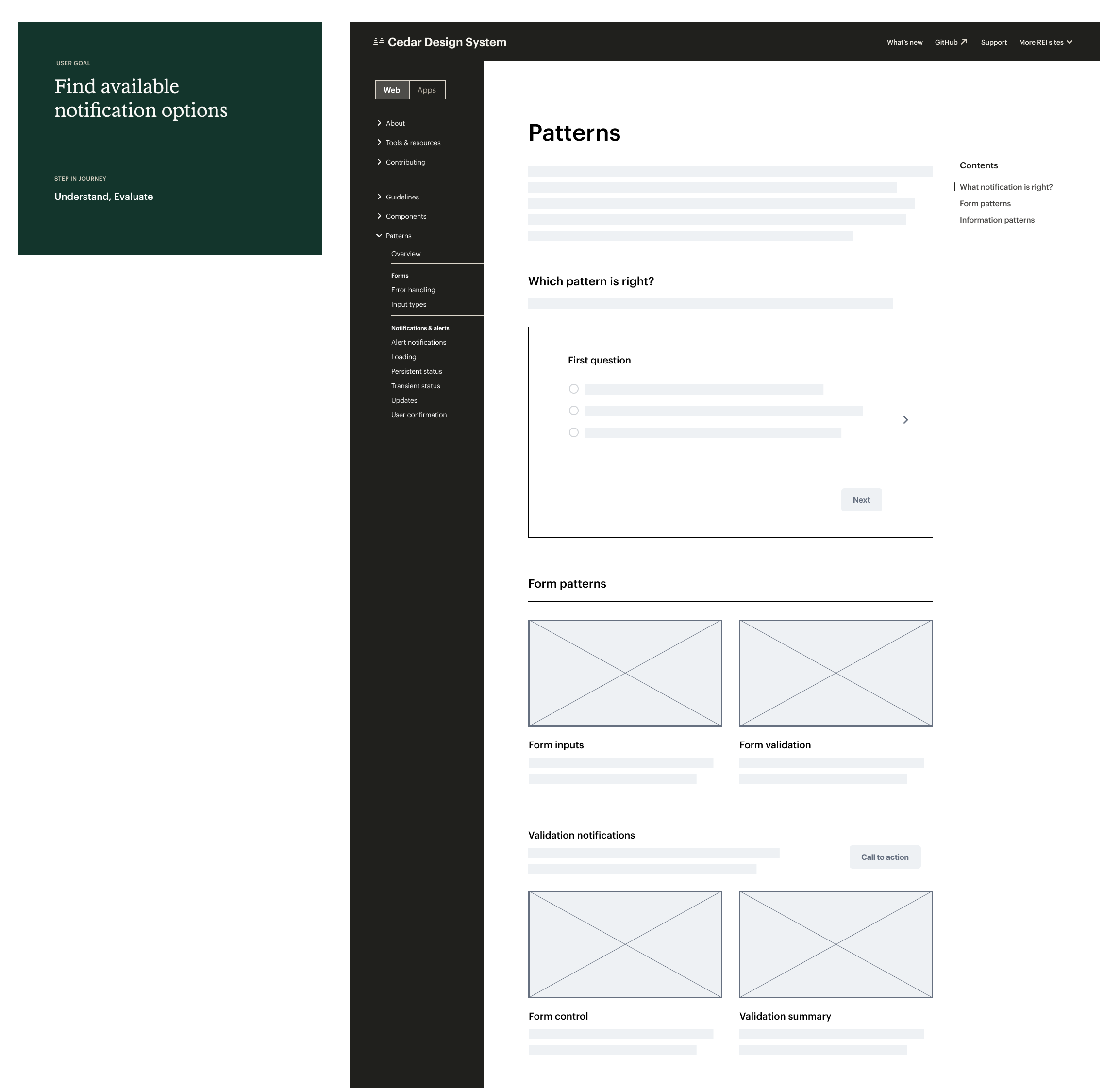
Flows & wireframes
We identified key user flows, which allowed us to swiftly move into creating prototypes. These prototypes were crucial in ensuring that our team's efforts were cohesive, documenting any emerging patterns, pinpointing content gaps, and breaking down the work into manageable tasks.
Partnering
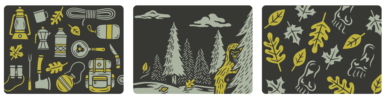
To cultivate strong partnerships and promote teamwork, we delved into the role of design across REI Co-op, encompassing physical products, retail locations, and product graphics, to shape the visual narrative of the website. We had the privilege of collaborating with REI’s exceptionally talented team of product illustrators to craft graphics for the site.
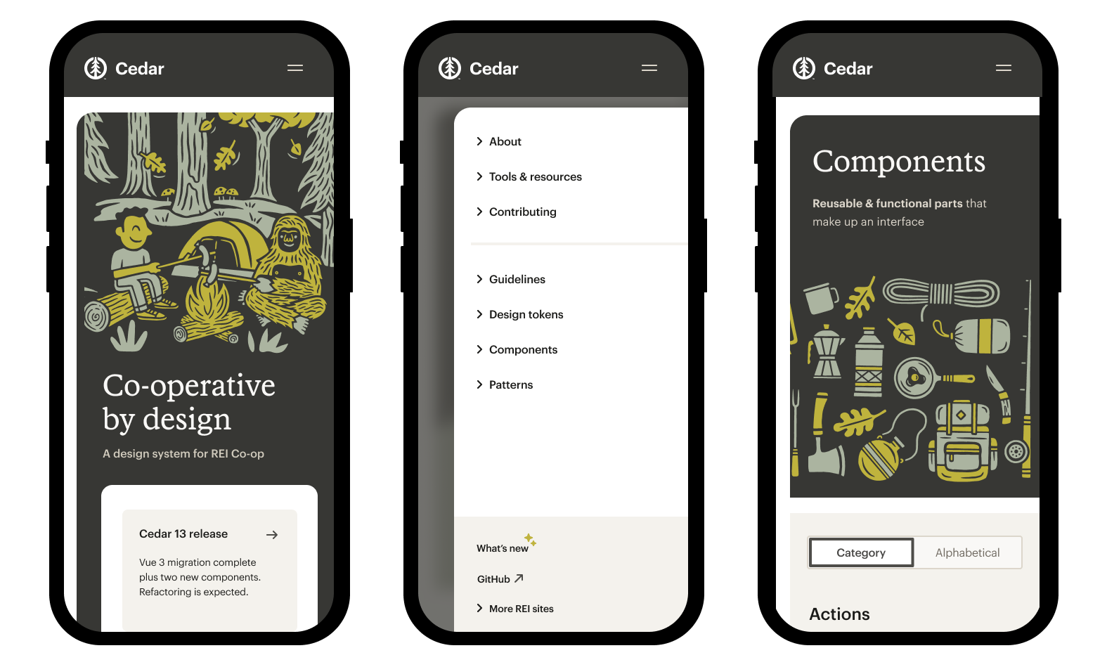
Detailed design
To bring shape to the design, we thought about the structure of REI stores. Take all the products out of stores, and they’re a solid backdrop to house and showcase the product. Similar to stores, the documentation site is there to house our product—the code and UI that express all the manifestations of the brand.
Outcomes
After conducting usability tests, we uncovered that the architecture, linking system, and design empowered users to effortlessly and confidently traverse the website.