onX Maps
Shifting a navigation framework
Setting the stage
When I joined onX Maps, I discovered that what people had been calling a design system was actually just a Figma toolkit with little connection to code assets.
After a lot of wrangling, presentations, alignment, education, meetings, Slack messages, and relationship building, we were in a position to start building components. We had a good foundation of tokens and documentation to fuel the next stage.
Information gathering
By conducting a UX analysis, I gained clarity on the most common components across our experiences. This allowed me to gather in-depth knowledge about each component.
Getting the community involved
I had a pretty clear understanding of the most heavily used components, but were there things I overlooked? What about what people are currently working on?
I saw an opportunity to get validation and get people invested in the design system roadmap.
Validation
The results aligned with what I saw. Plus, I was able to begin to form common terminology amongst a number of people by roughly illustrating each component.
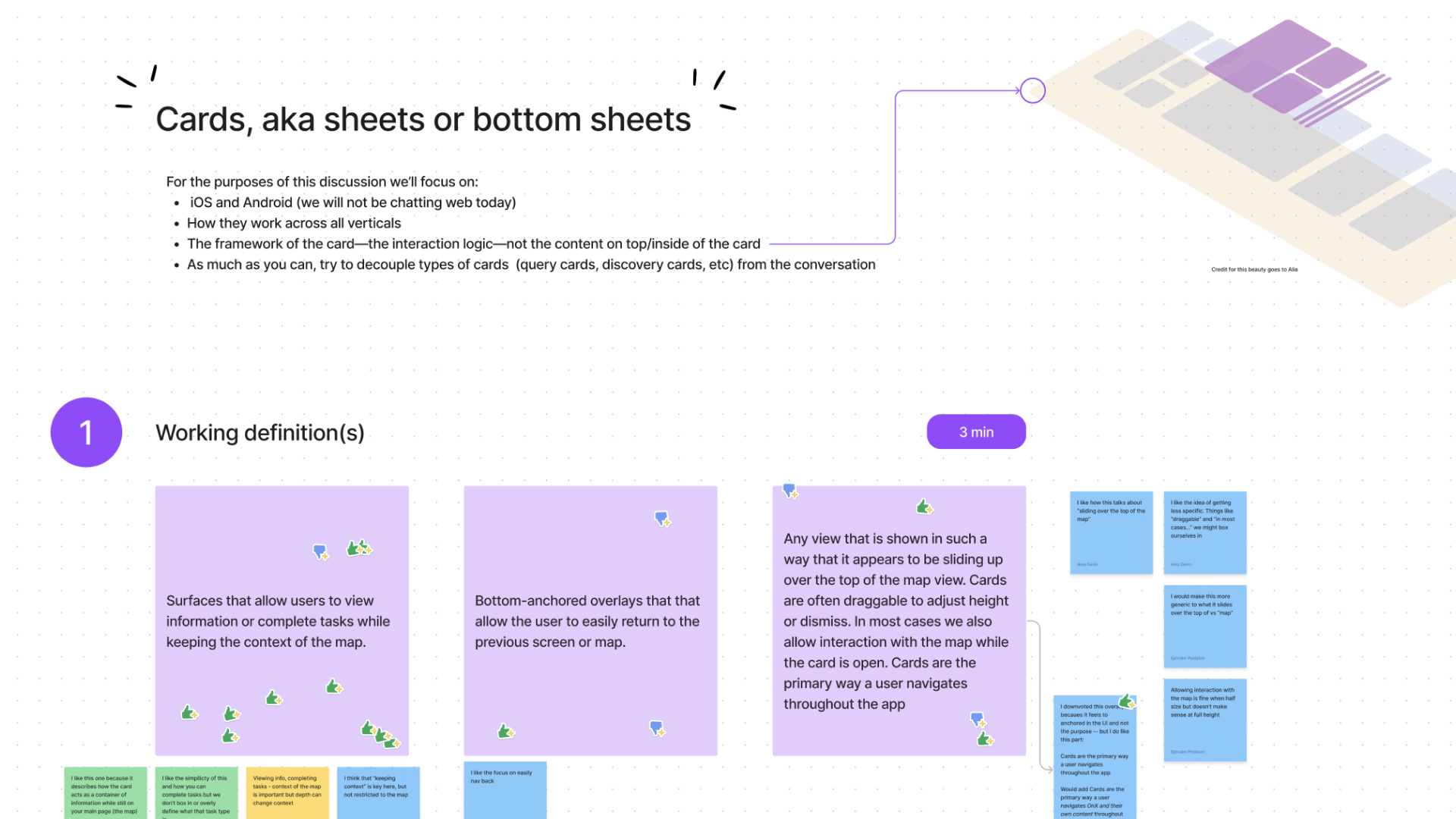
The most prevalent component: what people internally referred to as “card.”
Separating web and native components
The company referred to the component as a 'card', regardless of platform or interaction patterns. As I began using my secondary research sources and having sessions with my engineering partners, it became apparent that we needed to split the component into two.
Technical constraints
During sessions with the engineers, I began to understand the intricacy of the bottom sheet, especially in relation to the onX products. In particular, the interaction patterns in connection with the map. At first glance, it seemed like a straightforward component. However, there were numerous elements that needed to be defined to create a solid API.
1:1 sessions & workshops
During UX analysis, I saw a lot of inconsistencies within each product. This led me to investigate further with individual team members. Each team member tended to have a strong opinion on what the end solution would be. Many times, they were opposing views. So, I gathered the team back together for a workshop to establish a mutual understanding of the bottom sheet, collect use cases and feedback, and initiate the exploration of any existing research or knowledge.
Customer insights
We identified key user flows, which allowed us to swiftly move into creating prototypes. These prototypes were crucial in ensuring that our team's efforts were cohesive, documenting any emerging patterns, pinpointing content gaps, and breaking down the work into manageable tasks.
Accessibility recommendations
As WCAG is primarily focused on web, I used what I could derive from its recommendations and used other secondary sources for native experiences. I then made decisions about elements that were under discussion within the design team.
Design exploration with a navigational paradigm shift
Research, insights, and workshops pointed towards a significant change in navigating from one sheet to the next. This change was made to accommodate deeper content flows emerging in multiple product areas, helping give users a sense of place.
Engineering alignment
With a new navigation paradigm, we wanted to ensure that all possible scenarios were considered and that each party was fully aligned on the intended result. This process continued for as long as the engineers had questions—and there were many of them. I used quick sketches to help me visualize their questions and keep track of the response.
Design decision document & Figma component creation
After the workshop and design-sharing session, I received numerous messages with questions, comments, and preferences about the direction. Because of my knowledge gathering, I felt confident in the way forward and needed to communicate those decisions to the team. I prepared a document that we reviewed to gather all differing opinions in one place.
I consolidated all the documentation, specifications, and notes in one place to make the information easily accessible. Since it was the first component in the system, I established the framework and guidelines for its creation.
Testing
Learning is never done. The team is partnering with others to A/B test this critical component, specifically about including three detents. I also conducted usability testing focused on the navigational paradigm to create a clear path forward and better experiences for our users.
Generally, the bottom sheet and sheet header matched user expectations.
Participants understood navigation and moved between bottom sheets successfully by quickly accessing the back arrow navigation.
All participants used swipe functionality to increase or decrease the height of the sheet, with some seemingly forced to use internal scroll if they selected a specific area of the sheet to swipe. This indicates that follow-up work should be considered for internal scroll interactions.
Closing by swiping and/or tapping the map was generally used and understood. However, future consideration should be made to include an "x" close button across all sheets to increase completion and understanding of this close functionality.
Comprehension increased as participants were asked to perform similar actions. This suggests that it's important to maintain consistency within each app to enhance understanding of basic functionality.
Outcomes
Customer experience teams have noticed a decrease in the number of inquiries and comments from users who accidentally lost their work.
The UXR team has observed that participants are able to complete tasks more seamlessly when using the new approach, indicating improved usability.
There is much more consistency throughout each app due to high adoption rates.


