REI Co-op
Enabling brand through design systems
Brand & marketing changes
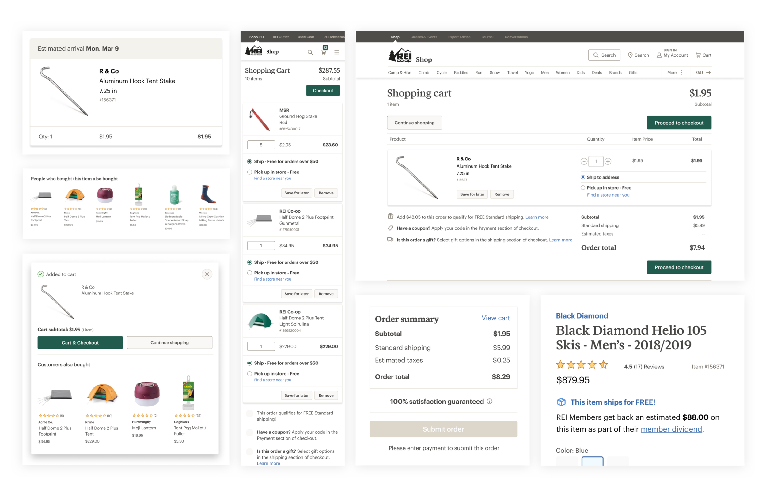
Upon the launch of a new brand by REI Co-op's marketing team, which involved changes in typography and color, the system team took on the task of ensuring the successful integration of the brand across the co-op's digital ecosystem. Capitalizing on this opportunity, the team extensively analyzed the optimal utilization of the new brand on the website, updated the usage guidelines, and offered valuable support to third-party properties.
UI testing
The team conducted thorough experimentation and testing on typography and color to ensure that we could introduce enhancements without disrupting the overall infrastructure. Our determinations regarding size, font weight, line height, and other text properties were based on extensive testing and aligned with UX and accessibility best practices.
Color framework
We developed an expanded palette in conjunction with the brand palette to address interaction and accessibility requirements. Furthermore, we established a framework for the palette, utilizing bezier curves to achieve optimal distribution of light, mid, and dark tones within the palette.
A series of tints and shades based on the Bezier curve was created to support interactive states. These colors were then translated into a palette for each brand color established by the marketing team, with a warm grey palette replacing a traditional black-to-white palette.
Application & UI testing
After refining the color palette, we integrated it into various components and patterns. Throughout this process, we conducted rigorous testing to ensure adherence to accessibility requirements, guaranteeing effective interaction with the design for all users.
Desirability study
We conducted a desirability study to determine whether the new application aligned with the intended brand tone.
Upon evaluating the data, we found no significant difference in task completion, perceived task ease, and alignment with the intended brand tone. However, when participants were asked which variable worked best for an outdoor company, the majority overwhelmingly preferred green tones. This insight enabled our team to make a prompt decision and proceed accordingly.
Outcome
In implementing these adjustments, we successfully improved the loading times of various pages in the system and guaranteed that they were in line with the brand for a more seamless experience. Additionally, we established a more user-friendly interface to ensure accessibility for all users.


